By Susan Duclos
The video below is an excellent recap of the past since the Fukushima meltdown after the 2011 earthquake and tsunami, as well as information leading right up until today, explained concisely and logically without embellishment.
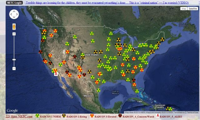
Below the video is the scariest chart seen to date from the Nuclear Emergency Tracking Center showing the conditions in North America at this time, in every state.
Source links will be below the chart and video.
For those still in denial about the amount of radiation that has come across the Pacific and into the United States of America, see the chart below.
Sources (clips)
https://www.youtube.com/watch?v=5-zfC…
https://www.youtube.com/watch?v=W69th…
https://www.youtube.com/watch?v=JJ5h1…
https://www.youtube.com/watch?v=Rrxmy…
http://www.youtube.com/watch?v=yTP_PP…
http://www.cnn.com/2013/09/04/world/a…
http://www.voanews.com/content/amid-c…
http://www.youtube.com/watch?v=DoTjlJ…
Sources (websites)
http://fukushima-diary.com/2012/05/ho…
http://www.vancouversun.com/travel/Su…
http://rt.com/news/fukushima-apocalyp…http://www.space.com/11115-japan-eart…
Susan Duclos owns/writes Wake up America
They'd better have it cleaned up before the NEXT Earthquake and Tsunami...
ReplyDelete